July 24, 2009
-
Superficial
So I generally consider myself as a person who is not superficial and cares more about the inner content of things rather than the packaging. So when it comes to things like people, books, restaurants, etc. that is true.
But on occasion with optional things I'm horrible!
 I definitely wouldn't consider myself a typography geek, but there are fonts that drive me crazy. Comic Sans (EWWWWWW) used to be cute, but it became over-used, and used in every elementary school related thing--newsletters, borders, worksheets. And now it just seems so bold and thick all the time. I feel really bad, but sometimes I just can't bring myself to read a page because it uses Comics Sans. For example, sometimes I'll just let myself wait until I receive my subscriptions to read someone's weblog so I don't have to go over and see things in Comics Sans. Other times I just grit my teeth and click. (: It is usually worth it; but I'm not the ony lone who is passionately anti-Comic Sans. I had a 15 minute talk with a friend about how terrible it was.
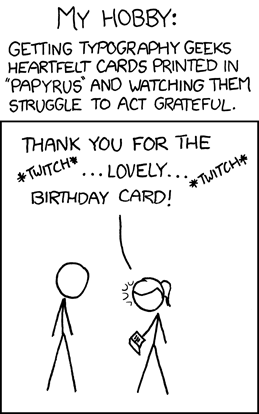
I'm not a fan of Papyrus either, but if going for old fashion-esque looks, I think something like Caligraphy works better. Broadway is a nice font. But again, I'm not a big fan of thick lettering, unless using bold face for emphasis.
Actually, come to think about it, I'm not a big fan of fonts without serifs either. Except Arial, but I don't like Arial if the font is larger than size 11.5pt.
Sometimes I feel like my antipathy comes from the fact that with school papers I am only allowed to use the standard font faces, and those often require a lot less ink and aren't as ornate, so when having to read pages and pages of it, it seems less overwhelming.
I'm also kind of terrible with things like comics also. For example if the cartoons are not aesthetically pleasing to me, I frequently will by pass them. So I know Get Fuzzy has been recommended to me a lot, but I only read it when specific ones are pointed out to me. Close to Home is a sore to the eyes, but since it is usually only one panel I usually will read it. Pearls Before Swine and xkcd are the best comics in my eyes, since they're both HILARIOUS and not bad to look at (actually, PBS is so cute).
Sometimes I feel bad about how superficial I can be, but at least I don't judge when it comes to things that matter (:.
Comments (2)
hmm.. not for nothing, but your font is a little difficult to read too.. not the actual font, but the font color.. it doesn't stand out enough and blends too easily with the background=/
@subaru3169 -
haha, fail! Yeah, I was going back and forth between several colors that all ended up blending in with different parts of the picture; or we just plain neon/overbearing. o_o